Skip to content

Article:The formatter "Accordion article teaser"

The article is suitable for creating news, press releases or blogs with optional images and texts in multiple paragraphs.

The accordion teaser displays the content in the form of an accordiont that is automatically generated by the list.

A special feature of accordion lists is that they do NOT link to a detail view, as all essential information of the content is already displayed in the accordion.

This teaser can only be used in a static list.

List with accordion article teasers

Landkarte mit Markierungen

It is now possible to assign custom icons to different locations on the map, making them easier to recognize and distinguish.

Baukasten für Datenschutzerklärungen

The new dynamic “Privacy Policy Builder” feature allows editors to create a privacy policy based on predefined standard texts.

Landkarte mit Markierungen

The map view has been expanded to include the option of displaying information about events taking place at the selected location in the marker pop-up.

A list of events can be displayed together with a map. Previously, however, only the locations where the events took place were shown as markers on the map. This meant that it was not clear which event were taking place at that location.

With version 19, in addition to the address of a location, the next events at that location can now also be displayed in a marker pop-up. In addition, all events at that location can be displayed as a list via a link in the pop-up.

Man in front of a wall with many pictures

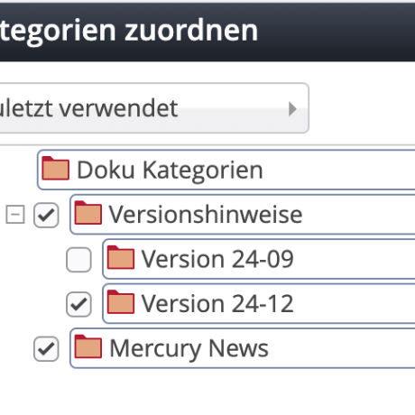
In the dialog for selecting a category, the system now automatically displays the most recently used categories in the new “Recently used” view.

View of the most recently used categories

Selecting categories in the form editor can be tedious, especially if there are a lot of categories and subcategories.

Users who have to assign the same categories over and over again often have had to “click” their way through the tree.

With version 19, the dialog for assigning categories in the form editor has been expanded to include the new “Last used” option. In this view, the system now automatically remembers the 50 most recently used categories. These are displayed in exactly the same way as in the “Tree” view, whereby the tree is reduced to the most recently used entries. 

A category is considered “used” if the user has clicked the checkbox for this category in one of the other views. 

The most recently used categories are saved individually for each user. If more than 50 categories are clicked over time, the system automatically removes the “oldest” from the “Last used” view.

Frau schaut durch eine Lupe

The “Meta Info” content element has been expanded and can now also be used to influence the order of hits in the internal search.

Eine junge Frau liegt auf dem Boden und liest Bücher

The Storyteller builds a screen-filling sequence of animated content with its own navigation. The display of each individual “page” can be customized.

Vertraulich bis zur Veröffentlichung

Content, such as news articles, which must remain visible only to certain editors until publication, even in the offline project, can now be easily created in the editor.

Occasionally, certain content, such as news articles, may only be visible to specific editors until it is published in the offline project, but should be visible to everyone after publication. With version 23-12, such content can now be easily created in the editor. Previously, this was only possible with considerable effort by manually setting permissions.

Mercury Newsletter im 'Cöln' Layout

The newsletter in the “Cöln” layoutDer in der letzten Version hinzugefügte Newsletter im “Cöln” Layout wurde um zusätzliche Ausgabemöglichkeiten erweitert. Möglich ist nun unter anderem die Verwendung von Icons sowie das links bzw. rechts Anordnen des Bildes neben den Text.

The following output options have been added:

  • Social media links.
  • People or contact elements with image and text.
  • Display of events with a “calendar look.”
  • Content section, article, and event with image on the left or right.

The new output options can, of course, be combined with the existing ones.

Icons on a screen

In addition to the existing “Awesome” icons, over 1500 additional high-quality icons from the Bootstrap project are now available. These can be used anywhere where icons can be specified by name.

Since version 5, Bootstrap has offered a comprehensive set of over 1,500 icons, which is actively being developed further. With milestone 23-03, the Bootstrap icons are now fully integrated into the Mercury template.

The Fork (Font) Awesome icons used previously are still available. It is possible to combine icons from different sets on a single website without any problems.

Name tags for persons

The content elements Organization and Person will replace the element Contact Information in the future. It is recommended that only these elements be used for new websites.

By separating the content into two different elements, the input mask can be better tailored to the respective element. In addition, specialized functions can be offered. For example, the organization can refer to a higher-level organization, and individuals can be assigned to an organization. This allows hierarchical structures between different departments or institutions to be mapped. 

Organisation

The Organization element allows you to display organizations, companies, institutions, or departments.

A special feature is that content elements of the Organization type can also be linked to each other, allowing you to map the hierarchy or structure of a larger organization. With the Organization formatter extended detail view, this hierarchy is automatically displayed and linked.

Elements of the Person type can also be assigned as contact persons for an organization.

Person

The Person element enables the representation of personal data.

Persons can be assigned to an Organization.

Disadvantages of the Contact Information element

The problem with the contact information input mask is that two different types of content can be entered in one mask, with the selection in the Contact Type field determining which type it should be.

The Contact Type field is preset to Person. In practice, this has led to situations where the editorial team sometimes enters data for an organization without also selecting Organization in the Contact Type field. Despite the incorrect setting, the output on the page differs only slightly and is therefore rarely noticed. Sometimes the editorial team even prefers the output that is actually incorrect.

It is important to note that information invisible to humans is stored for all contacts on the website, which search engines such as Google can use to recognize whether it is a person or an organization. For this purpose, the data is marked up according to the schema.org standard.

If the data for an organization is entered but “Person” is selected as the type of contact, the information is marked as a person and is invisible to search engines. This can lead to problems with a page's SEO ranking.

Availability of the Contact Information element

Whether and how the Contact Information element is available on your website depends on how your server has been configured. The following scenarios are possible:

  • Only Organization and Person are available; there is no Contact Information. This is the default for installations since Milestone 20.
  • Organization and Person are available, existing Contact Information can still be edited, but new information can no longer be created. We recommend this setting for older installations. In this case, existing content can continue to be used, but new content is created with the new elements.
  • Organization, Person, and Contact Information are available at the same time. In this case, all content can be created side by side. We do not recommend this setting.

Available element settings

Allows to change the element layout using predefined CSS modifications.

Please note that a specific element may not support all listed modifications.

Controls the importance level of the teaser headline in the list elements.

This is relevant for search engines (SEO) and will not change the visual "size" of the teaser headline.

The image format for small screens like smartphones.

Allows you to set the image size based on common formats.

The image will automatically be scaled so that the original pixels are best fitted to the selected target format.

Instead of the presets, you can also manually enter any format. Use "width-height", for example "5-1" for an extreme wide format.

The image format for large desktop screens.

Allows you to set the image size based on common formats.

The image will automatically be scaled so that the original pixels are best fitted to the selected target format.

Instead of the presets, you can also manually enter any format. Use "width-height", for example "5-1" for an extreme wide format.

Opens the first entry when the page is loaded.

Controls if multiple entries in the accordion can be opened simultaneously.

If this is not set opening an entry automatically closes the entry that is currently open.

A zoom option is added to the images.

Controls if the copyright information for teaser images is displayed as an overlay.

If available, the image title is displayed below the image.